Motion Graphics
Three GSAP-animated advertisement zones with smooth transitions, timed loops, and brand-compliant motion principles.
Campus Broadcast · Display System
Broadcast-style dynamic displays for a connected campus — inspired by CP24 news graphics.
Broadcast-style displays for a connected campus.
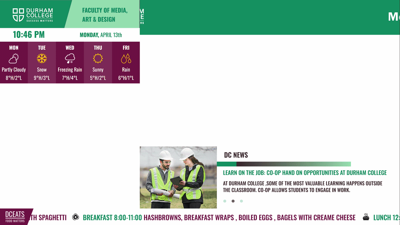
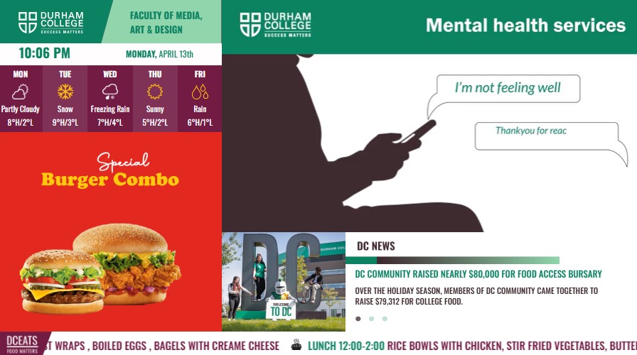
The initiative developed dynamic digital displays for flat-screen TVs across campus — modelled after broadcast news graphics similar to CP24. These signs communicate essential real-time information including time, weather, dining options, and promotions to support campus navigation for students, staff, and visitors from diverse backgrounds.
As UI Designer, I was responsible for organizing information hierarchically, developing prototypes, crafting visually engaging interfaces, incorporating stakeholder feedback, and improving the overall user experience to enhance campus communication effectiveness.
Designing for screens people walk past.
Campus signage demands a different kind of UX thinking — the audience is always in motion, the content is live, and the system must work for everyone from first-year students to visiting families.
Four stages from brief to broadcast.
Define objectives, gather requirements from stakeholders, and map out the full information hierarchy.
Develop unique visual styles per component — weather, news ticker, ad zones, and logo area.
Code and style all elements with HTML, CSS, JS, and PHP backend integration for live data.
Gather stakeholder feedback, refine visual hierarchy, and validate accessibility compliance.
What was shipped.
Three GSAP-animated advertisement zones with smooth transitions, timed loops, and brand-compliant motion principles.
Weather display, live news section, ticker tape, and logo area — each with its own visual language and responsive layout.
Database integration for dynamic content management — enabling real-time updates to promotions, dining menus, and announcements.
Ads running in the browser.
Three self-contained GSAP-animated advertisement zones — each loops seamlessly and integrates with the PHP content layer. Interact with them live below.
Ad concepts on screen.
Three motion graphics studies produced alongside the live GSAP builds — showcasing timing, easing, and brand-aligned composition.
Explore the full Durham College digital signage experience — live components, GSAP animations, and real-time data integration.
View Full Experience